skip to main |
skip to sidebar
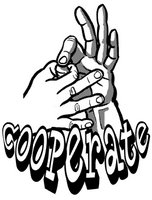
I am continually learning new things with Photoshop and my job affords me opportunities to experiment. For instance, one of the staff wanted me to come up with a simple t-shirt design, in like, no time for a workshop we will have at school. The only thing I had to go on is that the theme is "cooperation" and that he wanted to see an illustration of the American Sign Language hand sign for that word. Not bad. I drew up the hands, inked them, fooled around with some text, and layed out a simple design. The only problem was that the hands looked pretty flat and that the linework of the the fingers and the creases in the palm was too busy to distiguish what is going on. That's when I thought of a recent blog that I periodically read. Chris Wahl, who is an amazing illustrator, posted a short tutorial on creating halftones using Photoshop. Mike Zeck also gives a great tutorial on his site. The effect that is created is like zip-a-tone sheets used by cartoonists not long ago.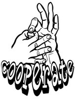
This is just a simple illustration that's going along with the LOTO unit. It's for a little story about a successful author who writes all of his stories using his lucky pen. He goes to a bar one night and he realizes that he lost the pen. He then tries searching for it.
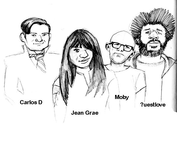
Here's a sketch I did while sitting at the local B & N. I wanted to draw some interesting, non-glamorous, faces. These were drawn from a cover of Urb magazine, which features some really cool news and reviews. Shout out to Polish Rob, my hip hop guru, for turning me on to it.
I rented the movie, A History of Violence by David Cronenberg, last night. I have a love/hate relationship with Cronenberg. I ususally just don't get his films but A History of Violence is more mainstream and easier for me to digest. I really liked it. Hey, it was also based on a comic book! Below is Ed Harris wanting coffee and William Hurt getting shot in the head.


 I initially try to figure out what the characters will look like by doing a variety of sketches. I thought the main character should be a nerdy kind of waif, hopefully making her a really tragic character.
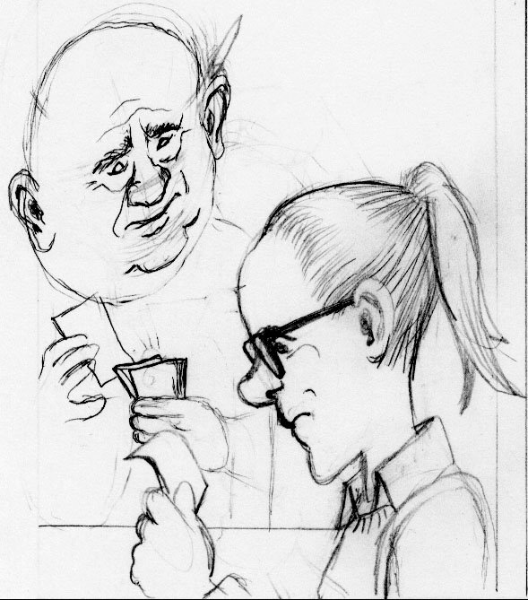
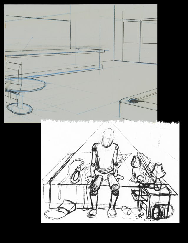 I do panel layouts, usually in non-photo blue pencil, add details with a mechanical pencil, go over everything in black ink, and use photoshop to bump up the contrast, add text, and tweak any blemmishes. Because I haven't been doing a lot of drawing lately I've found that I'm definitely out of practice. I'm especially having trouble figuring out my background perspective. Please feel free to give me any critique or advice. It would be much appreciated.